Introduction
During game development many tasks can be done simultaneously as long as the team is big enough. Things can get more difficult when you will try to make a game with a handful of friends or on your own.
Gameplay design, animations rigging, AI scripting, physics coding, UI creation – these are the tasks that you will have to face if you decide to become a one man army. Most of you wont have time or just wont be able to focus on all of these subjects, so you will most likely get basic animations rolling and create some gameplay around it. You will use provided physics engine and move on to AI scripting, create basic materials and use them to put together level prototypes.
Unreal Engine 4 provides variety of tools that will allow you to do just that. However, the UI creation tool – Unreal Motion Graphics (UMG) – is still on the way.
So while we’re all waiting, I decided to shed some light on Slate mysterious syntax by creating widget library that will allow you to prototype some basic game UI without much effort.
You may ask „why should I bother with Slate in C++ if I will be able to create UI much easier using UMG very soon?”. Well, the same reason people prefer to keep most of the gameplay logic in C++ rather than Blueprints. It’s much easier to maintain few large files of code rather than few blueprints with a lot of nodes in it (code is much more flexible). Blueprints are still a way to go when you want to quickly get some simple features running but if you would like to create more advanced class hierarchy or base your entire game on blueprints, sooner or later you will find out that not everything can be done in Epic’s visual scripting tool.
Same goes for User Interface – I’m sure that guys from Epic will do their best to make UMG a tool for simple and advanced visuals. But if you’re looking for some complex UI functionality – in my opinion, code always will be the answer. Besides, after you get the idea behind Slate syntax and basic widget designs it becomes really easy and fun to use.
In this tutorial I won’t focus much on Slate basics like, how to create a widget or add it to game viewport but you will see how to properly use Slate in code, create/bind delegates and attributes.
So just as a quick overview: I have put together two basic UI elements that most of action games has – resource bars (like health or mana) and skill/ability buttons. It will still require some coding (C++ & basic Slate Syntax), so for those of you scared of C++ – keep scrolling, maybe you’ll see something that will make you want to learn it :D.
Set-up
Ok, lets get started! First, most difficult part, will be to set things up:
- Download GUITutorial contents for UE 4.3 or for UE 4.4 (preview)
- Extract .rar file from above. You should be able to get two folders: GUILibrary and UI.
- Put GUILibrary folder inside your UE Runtime folder ( i.e. UnrealEngine-4.4\Engine\Source\Runtime ).
- Generate UE project files using GenerateProjectFiles.bat
- Create a new project or choose existing one. For this tutorial I created a new one called CodeTD using Code Top Down template.
- Put UI folder from 2. into your game content folder (for me it was CodeTD\Content)
- Open your project solution.
- Open CodeTD.Build.cs and add private dependencies to GUILibrary like this:
Note that you also must include dependencies for Slate and SlateCore if you haven’t already!
[cpp] PrivateDependencyModuleNames.AddRange(
new string[] {
"SlateCore",
"Slate",
"GUILibrary",
}
);
[/cpp] - Close Visual Studio and GenerateProjectFiles again to refresh intellisense. (You can generate project files for you project only)
- Initialize GUILibrary style called FGUIStyle. To do that go to CodeTD.h file and paste below code:
! Remember to replace CodeTD with your project name !
[cpp] #include "GUILibrary.h"class FCodeTDGameModule : public FDefaultGameModuleImpl
{
virtual void StartupModule() override
{
//Hot reload hack
FSlateStyleRegistry::UnRegisterSlateStyle(FGUIStyle::GetStyleSetName());
FGUIStyle::Initialize();
}virtual void ShutdownModule() override
{
FGUIStyle::Shutdown();
}
};
[/cpp] - Go to CodeTD.cpp and change IMPLEMENT_PRIMARY_GAME_MODULE macro first parameter to FCodeTDGameModule so it looks like this:
[cpp] IMPLEMENT_PRIMARY_GAME_MODULE(FCodeTDGameModule, CodeTD, "CodeTD");
[/cpp] - You are ready to go!
Classes description
Now, when the hardest part is behind you, time for some details about Library content:
My very first version of widgets library contains useful widgets for game UI prototyping. It will allow you to create quite valueable widgets with just few lines of code. Library includes 3 basic widgets:
Each one of this widget is using corresponding Slate Style classes: ResourceBarStyle, SkillButtonStyle, SkillsPanelStyle. Thanks to these assets you can control the look of your widgets.
This Library comes with some default styles included (inside UI folder you put in your game project content folder).
Resources bar examples
Creating a health bar
First up lets create a health bar. To do this you will need variable that represents Current Health value and Maximum Health value. Most likely you will declare those in you character class like this:
[cpp]
UPROPERTY(EditAnywhere, BlueprintReadWrite, Category = Resources)
float Health;
UPROPERTY(EditAnywhere, BlueprintReadWrite, Category = Resources)
float MaxHealth;
[/cpp]
You could create your health bar already, like this:
[cpp]
SNew(SResourceBar)
.Value(Health)
.MaxValue(MaxHealth)
[/cpp]
But it will just make a static container, since Health and MaxHealth are passed to SResourceBar once – at the construction time. To make the health bar dynamic, so it automatically reads value of both – Health and MaxHealth, you will have to create an Attribute. Attributes can be bound to a single value or to a getter function to this value that will be called every frame for an update. Since we’re in UObject we have to do the following:
[cpp]
// Create attributes as different variables so they can be referenced later on in code
TAttribute<float> Value = TAttribute<float>::Create(TAttribute<float>::FGetter::CreateUObject(this, &ACodeTDCharacter::GetCurrentHealth));
TAttribute<float> MaxValue = TAttribute<float>::Create(TAttribute<float>::FGetter::CreateUObject(this, &ACodeTDCharacter::GetMaxHealth));
[/cpp]
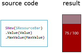
Now all you have to do is add newly created bar to game viewport:
[cpp]
GEngine->GameViewport->AddViewportWidgetContent(
SNew(SResourceBar)
.Value(Value)
.MaxValue(MaxValue)
);
[/cpp]
Executing above code will add bar widget to viewport but the widget will get greedy and take all allocated space. So to prevent that, lets say you want to add a your bar to top left corner and make it horizontal (it grows from left to right). First you will have to create a container for it. In this case it will be a SVerticalBox (a box that aligns its slots from top to bottom, for more on Slate Widgets click here)
[cpp]
GEngine->GameViewport->AddViewportWidgetContent(
// Create VerticalBox container
SNew(SVerticalBox)
// Add slot to it
+ SVerticalBox::Slot()
// Note that following settings are relevant ONLY for this slot content!
// Set slot to AutoHeight – this slot will adjust its height to it’s content height.
.AutoHeight()
// We want the content to be aligned to the left
.HAlign(HAlign_Left)
// set some padding so we dont end up to close to window border
.Padding(15)
[
SNew(SResourceBar)
.Value(Value)
.MaxValue(MaxValue)
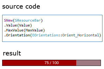
// by default SResourceBar is vertical (it grows from bottom to top) so lets make it horizontal
.Orientation(EOrientation::Orient_Horizontal)
]
);
[/cpp]
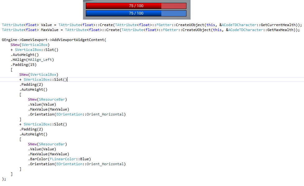
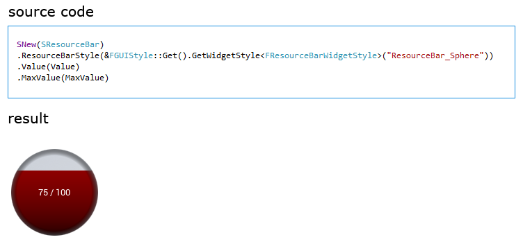
You should end up with a bar like this in top left corner of your screen (note that by default, I set Health to 75 and MaxHealth to 100):
You can of course (since UE 4.3) use unlit materials on Slate widgets to achieve more advanced visual look. On image below you can see two bars (health and mana) displayed by the same style (using materials) and same variables (ideally you would have separate Attributes for health and mana). Note that you can control bar’s color via code to quickly create different instances of the same resource bar.
There is a bunch of other parameters you can check out in code and/or style asset.
Resource bars examples with code that creates them
Among all other brushes that define look of your resource bar, you will find Decorator brush, which will be drawn on top of everything. This way you can add some interesting decorations like on the image below.

Resource bar + Decorator brush
Skills Panel and Buttons
As mentioned before SSkillsPanel (Panel) is a container for SSkillButton (Button). Panel can contain any number of buttons and it’s style is defined by FSkillsPanelWidgetStyle class where you can set things like buttons padding, minimal button size or default style of the button.
Note that buttons will be added to SUniformGridPanel. That means all buttons will have same size and this size will be specified by BIGGEST button!
So you are not able to have one 32×32 button while the rest remains 64×64 (all buttons will be 64×64 and smaller buttons will be stretched to 64×64).
To add button to a Panel you will have to use one of the AddSkillButton functions. The most common would be
[cpp]
void SSkillsPanel::AddSkillButton(FSimpleDelegate OnButtonClick)
[/cpp]
The one and only parameter of this function is a delegate that will be called after the button is clicked. FSimpleDelegate represents a function that does not reutrn anything and does not take any parameters. So to create a SimpleDelegate you will have to have a function similar to this:
[cpp]
UFUNCTION(BlueprintImplementableEvent)
void UseAbility1();
[/cpp]
Now you can create delegate from it. So lets assume you’re creating your UI inside character class and you added UseAbility1() function to it. To create a delegate that contains this function do the following:
[cpp]
FSimpleDelegate::CreateUObject(this, &ACodeTDCharacter::UseAbility1);
[/cpp]
Note that you can use different Create functions! More on Unreal delegates can be found here.
So the proper initialization of skill panel with one button inside ACodeTDCharacter class will look like this:
SkillsPanel->AddSkillButton(FSimpleDelegate::CreateUObject(this, &ACodeTDCharacter::UseAbility1));
[/cpp]
Using above code and few tweaks in Style assets you will achieve something like this:

Simple button inside Skills Panel
Buttons can also display Hotkey text (a key that given button is bound to). To set Hotkey text for a button you would have to use another AddSkillButton function, like this:
[cpp]
SkillsPanel->AddSkillButton(FSimpleDelegate::CreateUObject(this, &ACodeTDCharacter::UseAbility1), "1");
[/cpp]

Button with hotkey text below it
You can also make buttons to display their text inside them and control if it should be visible only on hover.

Button that displays Hotkey text inside itself and only on hover.
Just like resource bars, Panels can be aligned horizontally (default) or vertically by setting Orientation parameter during construction.
Other convenient version of AddSkillButton function would be
[cpp]
void SSkillsPanel::AddSkillButton(FUIAction InAction)
[/cpp]
FUIAction is a structure commonly used in editor widgets. It contains action that should be executed when Execute() is called but also a function to test if this action is available – CanExecute(). More on FUIAction can be found here.
In this case InAction is an action that will be executed when button is pressed. Button will also check if action can by executed (CanExecute function) to determine if it should be disabled or not. Using this function you can for example imitate cooldown for an ability that given button represents.
[cpp] // create local struct with static members that we will use for this examplestruct Local
{
// will be called to check if we can execute given action
static bool CanExecute()
{
return false;
}
// called on execute (on button click)
static void ExecuteAction()
{
}
};
FUIAction Action = FUIAction(
// For this example we’re using static struct members to define an action
// However, you most likely will use your character and/or skill manager class – you would then use CreateUObject instead CreateStatic
FExecuteAction::CreateStatic(&Local::ExecuteAction),
FCanExecuteAction::CreateStatic(&Local::CanExecute)
);
// Add button to a panel
SkillPanel->AddSkillButton(Action);
[/cpp]
Skills Panel Style
In Skills Panel style you can set some basic parameters like: minimum slot height and width, content padding, background brush etc. You can also specify default look of Button Style (ButtonStyle variable). ButtonStyle will be applied to any button that has no style defined through code. So if you want all buttons in the panel to look the same but only display different hotkey text you would have to do nothing but adding buttons to your Panel.
But most likely, above example wont be useful for anything else than prototyping. You will want to have panel where each button has different icon (representing different skill/option). To achieve this you can use Skill Buttons Styles array declared in Panel’s Style. This array will allow you to specify different button Style for each button that will be put inside this panel.
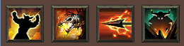
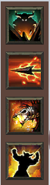
For example: you want to create panel with four buttons and you have created style for each button already. Ability1/2/3/4 are assets names of SkillButtonWidgetStyle.
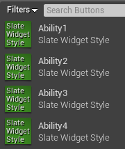
Now all you have to do is add those Button styles to mentioned array in panel’s style.
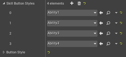
So if, in code, you will now call
[cpp]
// Will use Ability1 Style
SkillsPanel->AddSkillButton(FSimpleDelegate::CreateUObject(this, &ACodeTDCharacter::UseAbility1), "1");
// Will use Ability2 Style
SkillsPanel->AddSkillButton(FSimpleDelegate::CreateUObject(this, &ACodeTDCharacter::UseAbility2), "2");
// Will use Ability3 Style
SkillsPanel->AddSkillButton(FSimpleDelegate::CreateUObject(this, &ACodeTDCharacter::UseAbility3), "3");
// Will use Ability4 Style
SkillsPanel->AddSkillButton(FSimpleDelegate::CreateUObject(this, &ACodeTDCharacter::UseAbility4), "4");
[/cpp]
First button will use first style in Skill Button Styles array in SkillsPanel style. Second button will use second style in Skill Button Styles array in SkillsPanel style. Third button will use third… you get the idea.
Note that if you have only 3 styles added to the array and you add 4 buttons to the Panel, the fourth button will use default Button Style defined by SkillsPanel Style.
Example usage
With help of our graphics designer I was able to create example character panel in a few minutes (I spent most of the time tweaking style parameters of the widgets inside editor). This panel is also created using FUICommands that are not fully supported yet so I wont describe it right now.
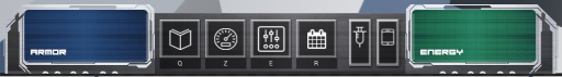
It’s a very typical panel where you have two resource bars – one on the left and right (Armor and Energy). These bars sourrounds two buttons panels – first, with square buttons and labels represents Abilities, second one (rectangle buttons) is for some options and/or inventory.
From the left we’ve got: SResourceBar, SkillsPanel, SSkillsPanel and another SResourceBar. All with different styles.
And here you can get a code snippet that generates similar panel:
[cpp] TAttribute<float> Value = TAttribute<float>::Create(TAttribute<float>::FGetter::CreateUObject(this, /** YOUR GETTER FUNCTION HERE */ ));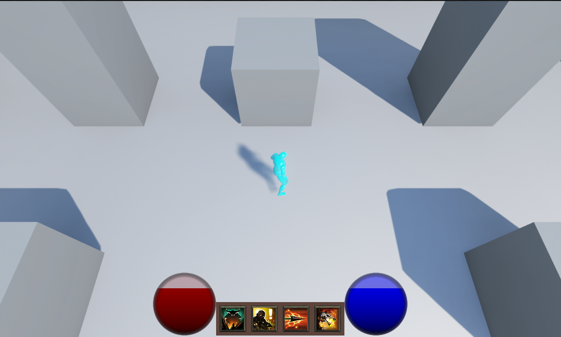
TAttribute<float> MaxValue = TAttribute<float>::Create(TAttribute<float>::FGetter::CreateUObject(this, /** YOUR GETTER FUNCTION HERE */ ));
// Create Skill panel
TSharedPtr<SSkillsPanel> SkillsPanel = SNew(SSkillsPanel);
// And add some buttons to it
SkillsPanel->AddSkillButton(FSimpleDelegate());
SkillsPanel->AddSkillButton(FSimpleDelegate());
SkillsPanel->AddSkillButton(FSimpleDelegate());
SkillsPanel->AddSkillButton(FSimpleDelegate());
GEngine->GameViewport->AddViewportWidgetContent(
SNew(SVerticalBox)
+ SVerticalBox::Slot()
.VAlign(VAlign_Bottom)
.HAlign(HAlign_Center)
.Padding(15)
[
SNew(SHorizontalBox)
+ SHorizontalBox::Slot()
.HAlign(HAlign_Right)
.VAlign(VAlign_Bottom)
[
// Add health bar
SNew(SResourceBar)
.ResourceBarStyle(&FGUIStyle::Get().GetWidgetStyle<FResourceBarWidgetStyle>("ResourceBar_Sphere"))
.Value(Value)
.MaxValue(MaxValue)
]
+ SHorizontalBox::Slot()
.AutoWidth()
.VAlign(VAlign_Bottom)
[
// Add skill panel
SkillsPanel.ToSharedRef()
]
+ SHorizontalBox::Slot()
.HAlign(HAlign_Left)
.VAlign(VAlign_Bottom)
[
// Add mana bar
SNew(SResourceBar)
.ResourceBarStyle(&FGUIStyle::Get().GetWidgetStyle<FResourceBarWidgetStyle>("ResourceBar_Sphere"))
.BarColor(FLinearColor::Blue)
.Value(Value)
.MaxValue(MaxValue)
]
]
);
[/cpp]
Final notes:
– support for FUICommands in skills buttons
– connect buttons with bound action so when user pushes a key on a keyboard, button will change it’s state
– circular resource bars based on parametric materials
– drag&drop support for buttons on skill panel
– many improvements!
All „skills” icons used comes from Diablo 3, copyrighted by Blizzard Entertainment.
Great article! I did have two quick questions if you have time. I know this article is from awhile ago in UE4 time, so is Slate something that is still used or would I just do it in C++ in UMG?
If Slate is still the way to go code wise, it looks like the GUITutorial is no longer available, do you know where I can get that code?
Thanks!
Hi, yeah, this article is really outdated and I dont think it’s going to work on versions 4.6+, however, most of its code still applies when it comes to creation of Slate widgets.
Please keep in mind that Slate is something that will most likely never reach status of 'not used anymore’. UMG is just a visual editor for Slate (there is no UMG without Slate) and is created using Slate widgets itself.
Most of the time UMG will be sufficient for your game UI but if you would like to create a custom widget, you will have to do it in Slate (C++). There is bunch of tutorials already how to create your own widget that will be useable in UMG so you wont have any problems with doing that.
Also, links for source code of this article are working for me so I’m not sure why you cant download it.
Cheers!